
Activity – Excel 5: Creating a column chart
- Start a new Excel workbook.
- Enter the following data.
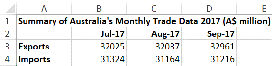
Source: Commonwealth of Australia, Department of Foreign Affairs and Trade, 2017.
3 .Click the File tab and then Save As to save the spreadsheet as Your Name TEP021 Excel 5 in the Documents folder on your computer.
Creating a Column Chart
A column chart is used to compare values across a few categories. Use it when the order of categories is not important.
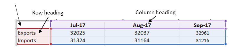
- Select A2:D4.
Make sure column headings and row headings are both included in your selection when creating charts, including the cell in the corner, even if it is empty.
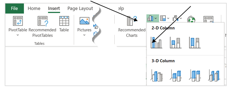
2. On the Insert tab, click the Column Chart icon and select the 2-D Clustered Column.
3. Move the mouse pointer onto the chart. When the mouse pointer changes to this icon, click ,  and drag the chart below the data table.
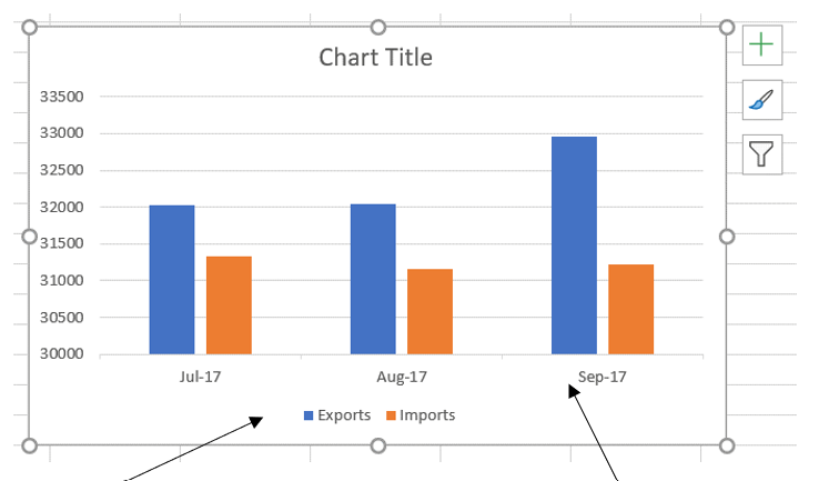
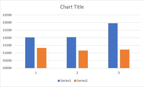
Column headings and row headings are used as horizontal axis labels and legend series on a chart. If they are not included in the selection when creating a chart, the horizontal axis will be labelled as 1, 2, 3…, and the Legend will become Series 1, Series 2 … This will make the chart very difficult to understand. For example, in the chart below, you don’t know what each colour represents and what each group is.
Adding Chart Elements
A chart must contain enough information for readers to understand what it is about.
4. Double-click Chart Title and then type Summary of Australia’s Monthly Trade Data 2017.

5. Click the Chart Elements icon and then tick the box for Axis Titles. You can add or remove chart elements by ticking or ticking off the boxes here.
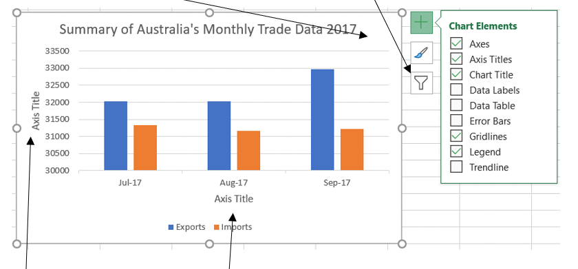
The generic vertical Axis Title and horizontal Axis Title are displayed on the chart.
6. Click the vertical Axis Title, type A$ million and press Enter key.
7. Click the horizontal Axis Title and press the Delete key to delete it.
There is no need for a horizontal Axis Title because the labels Jul-17, Aug-17 and Sep-17 are already very clear.
Formatting Chart Background
-
- Click the Format tab.
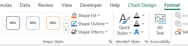
2. Click the More button on the Shape Styles. Try each of the styles and then select one for your chart.
3. Switch to Page Layout view by clicking the Page Layout icon at the lower-right corner of the Excel window.

4. Check that the chart has not split across two pages. If it has, resize the chart by dragging the corners to fit it into the page OR drag the chart below the table.
5. Save and close your workbook.