
Incorporating infographics in your text
A graphic should be used along with document formatting (such as headings and lists) to improve readability and to organise the information efficiently in your document or presentation. You have already learned about heading styles in week 7, so let’s focus on what makes a good graphic:
A good graphic should:
- Clearly add to the information or ideas that you are presenting in your written work or presentation and help to express your ideas visually.
- Be self-contained and include all necessary details so that the reader can understand the information in the graphic, even if it is used in an alternative context such as a presentation or poster. The necessary details include who, what, when, and where the topic relates to, and this information is included in the labels and titles (called captions).
Regardless of which style guide you are asked to use, there are some common rules that you should remember as indicated below.
Figure 1
Five Rules for Integrating Visual Elements into your Document.
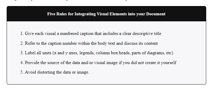
Note. Adapted from Last, Suzan, 2019. University of Victoria. EBOOK ISBN 9781550586657.
The diagram below is from the Australian Government Employment Outlook report undertaken in 2021. Consider what information is being depicted. Can you identify what could be added to help the reader understand what the graph is depicting?
Figure 2
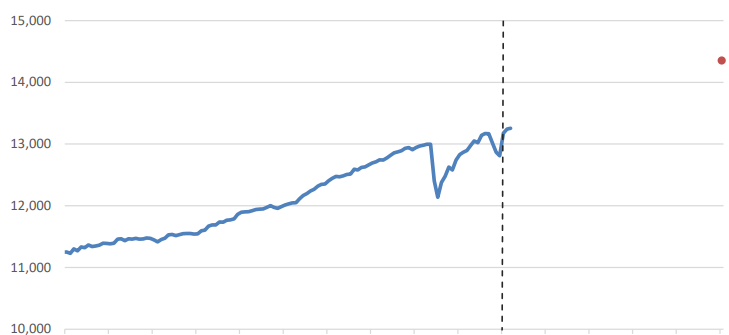
Note. Adapted from National Skills Commission, 2021 Employment Outlook (five years to November 2026), National Skills Commission. https://www.nationalskillscommission.gov.au/topics/employment-projections. CC BY 4.0 AU.
Feedback
Without clear labels and a descriptive title (caption), it is difficult to decipher the information portrayed in the graph. Now, look at the graph below with the addition of the axis labels, a legend, and a descriptive caption.
Figure 3
Employment Level, Past and Projected Growth to November 2026, Australia (‘000s)
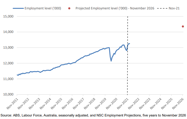
Note. From National Skills Commission, 2021 Employment Outlook (five years to November 2026), National Skills Commission. https://www.nationalskillscommission.gov.au/topics/employment-projections. CC BY 4.0 AU.
Feedback
The addition of a detailed caption that explains the information in the graph, suitable axis labels, and a legend in Figure 3 helps the reader to better understand the information being presented. Notice that the attribution is also provided underneath the figure. This figure has been taken directly from the original document and has not been modified to ensure that it abides with the five key rules. There can be the temptation to reduce the size of an image to make it fit neatly on a page, however, it is important to resist this temptation as it often makes it difficult to interpret the information if it is too small.
Referring to figures and tables in your text
Any graphic that you include in your academic documents must be referred to in your text before they are presented. This is so the reader has all the relevant information they require beforehand. It is essential that this document text:
- directs the reader when to look at the figure before it appears. (Notice the previous paragraph referred to figure 3 in the first sentence.)
- introduces the contents of the figure or table.
- highlights key points or trends that you want your reader to be aware of.
- may include conclusions that you would like to draw from the figure or table. Note that depending on the discipline and purpose of the infographic, this may vary.
Follow the steps below when referring to the graphics in your text:
- An infographic should be included directly after the text where it has been referred to.
- Refer to the infographic by its label (figure or table) and number.
For example, “Figure 2 shows the…”, rather than “the image below shows the…”. - When referring to an infographic, you can use the parenetical or narrative format, similar to citing a journal article (see week 5).
An example of a narrative citation is “As can be seen in Figure 3, employment in Australia has increased from 2011 to 2019”.
An example of a parenthetical citation is “Employment level in Australia is expected to continue to grow until 2026 (Figure 3)”.
Below is an example of how you could do this using Figure 3.
Employment rates in Australia are increasing but are susceptible to further outbreaks of COVID-19. Figure 3 shows the number of people employed in Australia from November 2011 to November 2021 and includes their forecast for 2026 (the red dot). What is interesting to note is that the drop in employment between 2019-2020 coincides with the COVID-19 outbreak. Whilst employment rates are expected to increase, this growth could be impacted by future outbreaks of COVID-19.