
Activity – Infographics 3: Creating a line graph
[This section should take you around 25 minutes to complete]
For this activity, you will be creating an infographic to demonstrate what happens over a period of time. From Table 1 we can see that a line graph is a suitable infographic to use for this. The X-axis of a line graph shows the time variable, and the Y-axis shows what variable is being measured. Since a line graph can have peaks and troughs, it enables you to highlight trends or patterns that would not be as obvious in a table or other form of an infographic.
“A variable is any characteristics, number, or quantity that can be measured or counted. A variable may also be called a data item. Age, sex, business income and expenses, country of birth, capital expenditure, class grades, eye colour and vehicle type are examples of variables.”
Australian Bureau of Statistics, nd, Statistical Language – What are Variables? (https://www.abs.gov.au/websitedbs/D3310114.nsf/home/statistical+language+-+what+are+variables).
Organising data into a table
The first step in designing a line graph is constructing an Excel table to organise your data. If you are using information from a government or other organisation’s reports, the data may already be organised into tables. In the following activities, you will use some data from larger tables to construct your tables. You will then create a line graph using the new tables.
Tables can be organised in different ways, depending on the relationships that you are examining. To create a line graph in Excel, you will need to organise your data in a way that enables the graph to be constructed to show the relationship between the items, or variables being compared. Tables in Excel may need to be re-organised to ensure that the correct graph is created.
The variables that you are comparing (measuring) are placed in columns, rather than across rows. That way the data for each variable can be read down, and not across. The first column of a table lists the items (variable) that become the X-axis of the line graph. The items (variable) in the other columns list the specific characteristics (quantity or value) being compared and appear on the Y-axis of a line graph.
The data we will use comes from the Grains Research & Development Corporation (GRDC) Research, Development and Extension Plan 2018-23 (2020), and you will need to use some of the data from the tables to construct a table.
Table 1
Top Australian grain export commodities by value ($m)
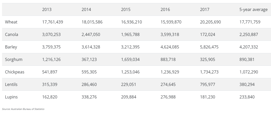
Note. Adapted from Grains Research & Development Corporation (2020), GRDC Research, Development and Extension Plan 2018-23. https://rdeplan.grdc.com.au/industry-at-a-glance (Archived website)
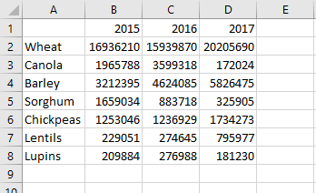
- Open a new blank Excel spreadsheet and Save as Your Name TEP021 Infographics 3
- Add the data for the years 2015 to 2017 as shown below:
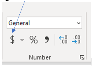
3. Format the data into currency using the $ icon in the Number ribbon.
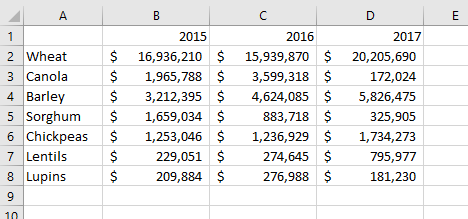
4. Use Decrease decimal to show only the whole numbers. This is done by highlighting all the values in the table (except for the headings) and selecting the Decrease Decimal option in the Number ribbon.
5. Select the cell range A1:D1 and,
6. Hold down the Control key (<Ctrl>) and select the cell ranges A3:D3 and,
7. Hold down the Control key (<Ctrl>) and select the cell ranges A5:D6.
You should now see the following range of non-contiguous cells selected:
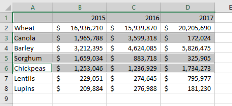
8. You will use the highlighted rows to create a line graph.
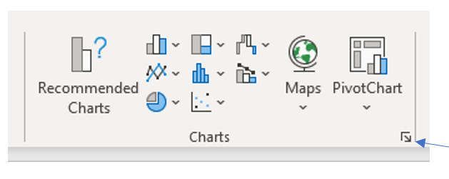
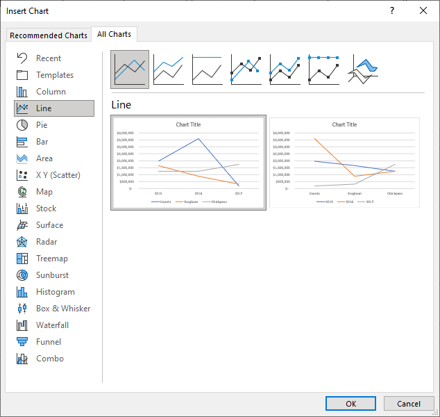
Click on the Insert menu and select the arrow (called the Dialog launcher) on the Charts ribbon to open the Insert Chart dialogue box. From here you will be able to select a chart type.
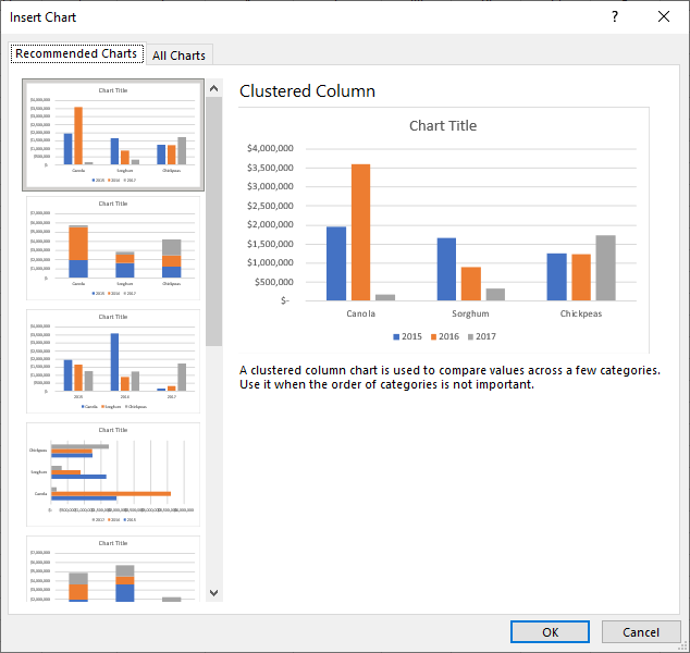
9. Click on the All Charts tab and then the Line option from the list of chart types.
10. Select the line chart that shows the data plotted over time (years).
You will see a graph showing the price of each of the chosen grains from 2015 to 2017.
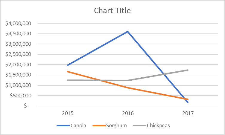
You will be pasting a copy of this image into a Word document, so it requires a little more formatting to get it ready.
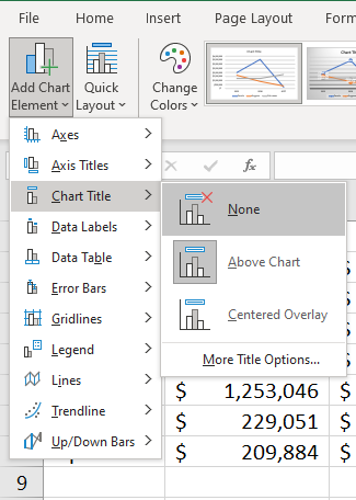
11. Click on the Chart to select it and then click the Chart Design menu.
12. Click on Add Chart Element from the toolbar ribbon.
13. Select Chart Title and None to remove the title.
Hint: You can also click on the chart title and use the delete key on your keyboard.
14. Save your file and keep it open.